this tutorial videos we learn how to make windows loading type effect in CSS so let's start
first and we sketch our <html> page and then use CSS to make these effects.
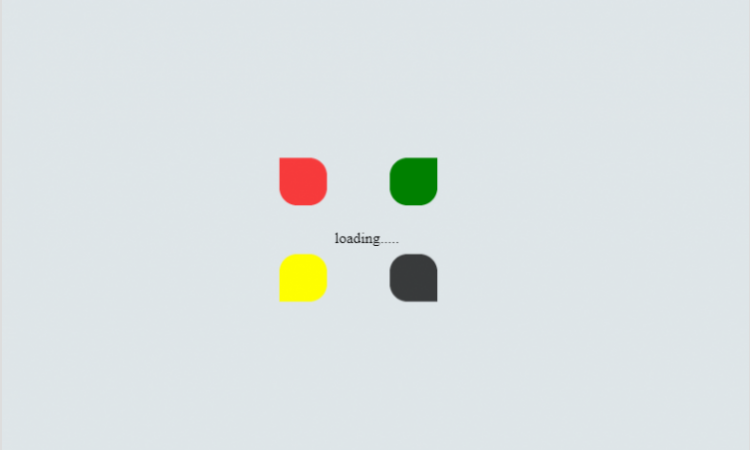
in our html code we make a <div> and give it a class name loading,
then in this <div> we use 5 <span> and give each <span> a unique id and then we close our opening
<div> tag.
here is complete video of this content
here is complete code of html page and CSS
<!DOCTYPE html>
<html>
<head>
<title>
Windows style Loading Effects
</title>
<link rel="stylesheet" href="style.css">
</head>
<body>
<div class="loading">
<span id="first"></span>
<span id="second"></span>
<span id="third"></span>
<span id="forth"></span>
<span id="fifth">loading.....</span>
</div>
</body>
</html>
now it's time to move on our CSS part. we use external CSS file and link this file in the <header> tag
in CSS we give <body> tag padding, margin, display, height, and make the content in the center of the page
using align-item and justify-content center and give it nice background.
body {
padding: 0px;
margin: 0px;
display: flex;
height: 100vh;
align-items: center;
justify-content: center;
background: #dfe6e9;
}
now we move on our loading class the main <div> here we give fixed width and height and position property
.loading {
position: relative;
width: 300px;
height: 200px;
}
and now we take our first <span> element and use its id which is first in this we give it height of 50px, width 50px,
background color red and position absolute and top and left 0 and give it animation name first 2 second linear
infinite and animation- direction alternate we use keyframes to animate it here is the code
#first {
height: 50px;
width: 50px;
background: red;
position: absolute;
top: 0;
left: 0;
animation: first 2s linear infinite;
animation-direction: alternate;
}
@keyframes first {
to {
transform: translate (90px, 100px);
border-radius: 0 50% 50% 50%;
}
from {
opacity: 0.0;
}
}
now we move on our second <span> element and the id of this element is second we use same properties as we use
in the first element with little difference which is in the keyframes part in first we used transform and translate
first element to 90px, 100px and border radius 0% 50% 50% 50%
and in this element, we use translate transform to -90px, 100px and border radius is 50% 0 50% 50% here is code
of second element
#second {
height: 50px;
width: 50px;
background: green;
position: absolute;
top: 0;
right: 0;
animation: second 2s linear infinite;
animation-direction: alternate;
}
@keyframes second {
to {
transform: translate(-90px, 100px);
border-radius: 50% 0 50% 50%;
}
}
we use almost same code in the remaining elements and the difference of the code in the keyframes part here is the
remaining elements code
#third {
height: 50px;
width: 50px;
background: yellow;
position: absolute;
top: 250px;
left: 0;
animation: third 2s linear infinite;
animation-direction: alternate;
}
@keyframes third {
to {
transform: translate(90px, -100px);
border-radius: 50% 50% 50% 0;
}
}
#forth {
height: 50px;
width: 50px;
background: black;
position: absolute;
top: 250px;
right: 0;
animation: forth 2s linear infinite;
animation-direction: alternate;
}
@keyframes forth {
to {
transform: translate(-90px, -100px);
border-radius: 50% 50% 0 50%;
}
from {
opacity: 0.0;
}
}
#fifth {
position: absolute;
top: 150px;
left: 125px;
}
I hope you like this